Wood Engraving: Fire Bear
- Category
- Laser Projects
- Posted
- November 22, 2024
- Updated
- September 16, 2026
- By
- Jacob Lloyd — written with AI assistance, post-project
- Read time
- 9 min read
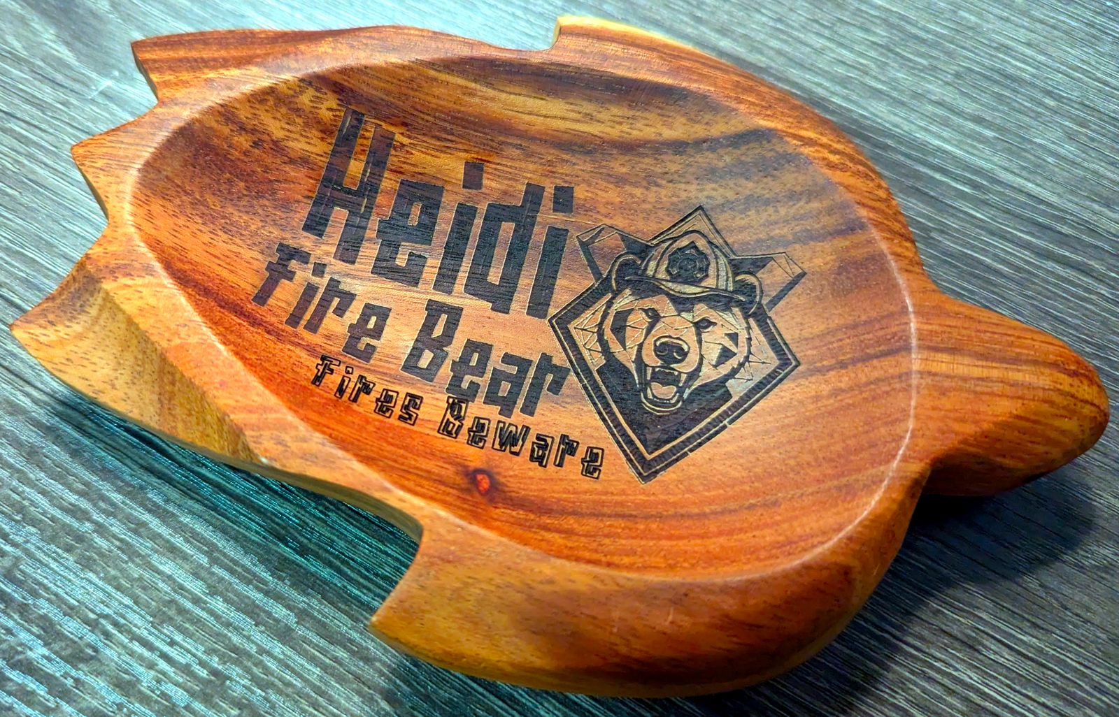
In plain terms: A gift project from start to finish: using AI to design a custom firefighter-bear logo, then laser-engraving it onto a carved wooden tray. It walks through the free design tools, the layout software, and the actual burn. The result looks like a professionally made present without the professional price.
A firefighter I know deserved a present, so I engraved a custom fire-bear logo onto a carved wooden tray. This post is the whole trip: generating the logo with AI, grabbing a free typeface, setting it all up in xTool Creative Space, and burning it into dark hardwood.
tl;dr
- What it is: a personalized logo engraved on a carved hardwood tray.
- What it costs: basically nothing beyond the tray blank — the AI image generator and the typeface were free.
- What you need: a laser engraver that can mark wood (I used an xTool F1), xTool Creative Space (free), and an image generator.
- What you end up with: a one-of-a-kind gift that looks like you paid someone real money for it.
The finished piece
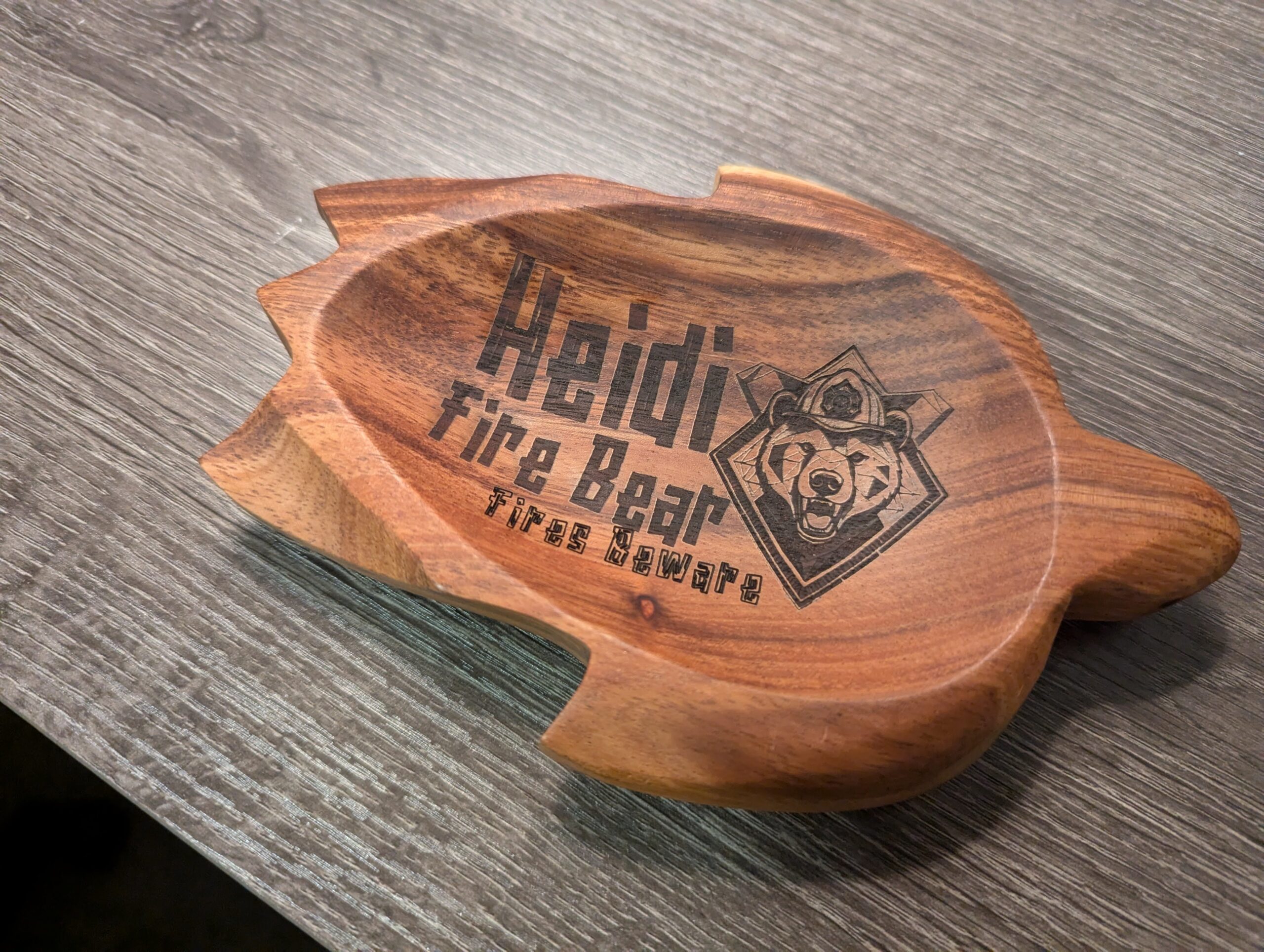
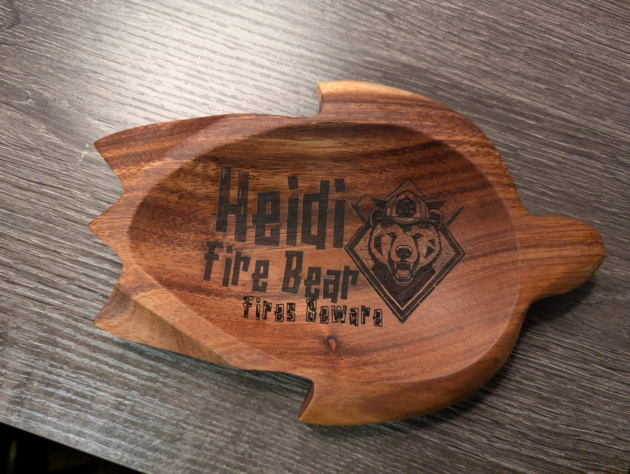
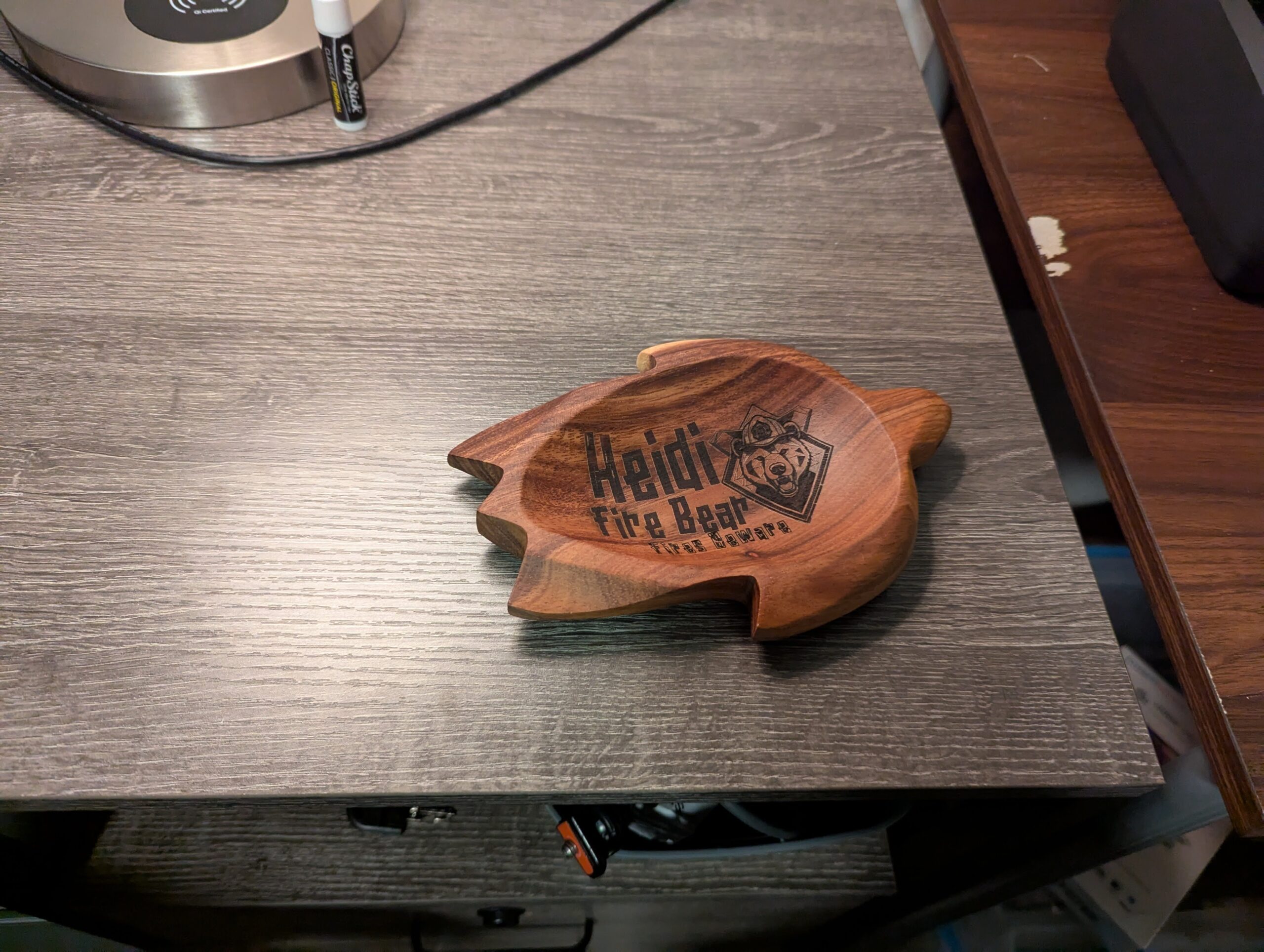
Results first. The blank was a pre-carved turtle-shaped tray in a dark hardwood — acacia, by the look of the grain. The engraving is the AI-generated bear badge plus text in a custom typeface.
Tools and material
- Laser: xTool F1. Any engraver that can mark wood will do — for wood you want the diode laser, not infrared.
- Software: xTool Creative Space (free). Not sponsored by xTool, it's just what runs my machine.
- Material: a pre-carved turtle tray blank, dark hardwood. I didn't turn this on a lathe — the blank came carved, I just made it personal.
Safety: lasers are inherently hazardous — use appropriate eye protection and precautions. Wood is flammable, and you are aiming a fire machine at it. Ventilate, watch the job, keep something nearby to smother a flare-up.
Making the logo
The steps below are how I designed this logo. If you already have one, skip ahead. I reused this same AI-logo-to-laser workflow later for the nametag placard and business-card holder, so the screenshots there will look familiar.
The concept: an intense bear with firefighting elements — a helmet, maybe a badge. Nothing too specific in mind beyond looking cool, not being obviously AI generated, and being something the recipient would actually like.
Making the art: if you can draw, draw. I can't, so I generated the design with AI (Stable Diffusion).
Pro tip: I use getimg.ai, but any AI image generator works. Not sponsored or affiliated — it's just what I use.
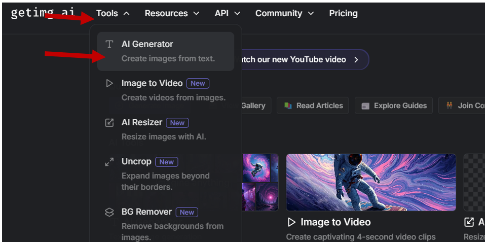
1. Log into your generator of choice and open the generation page.
2. Input what you want an image of. Below is what I finished with after about a dozen refinements:
Details of image generation: Fire Bear Logo
Mode: Text to Image generation
Generation Type: SD
Prompt (what we want in the image):
(a fire fighter, fire fighter badge. fire axe. no background.), woman bear, cute. geometric.
A stylized logo featuring a bear (fire fighter), designed in a geometric art style. The bear should be depicted in a dynamic pose, with sharp, angular lines that emphasize its fierce expression. The shark mouth should be exaggerated, showcasing sharp teeth and a playful yet intimidating vibe. Use a limited color palette with bold contrasts, incorporating shades of blue, gray, and earthy tones. The background should be minimalistic, focusing on the geometric elements and the unique animal combination.
Negative Prompt (what we don't want in the image):
Disfigured, cartoon, blurry, nude, background, weapon
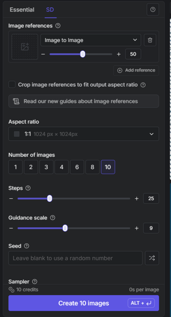
Number of images: start with two until you get close to what you want, then go up to 10 when you're pretty close
Steps: 25
Guidance Scale: 9
Sampler: LMS Karras
Change whatever you want in these settings to get your desired image.
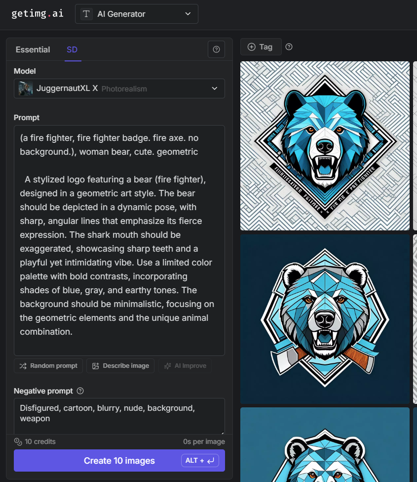
Image generation settings continued:
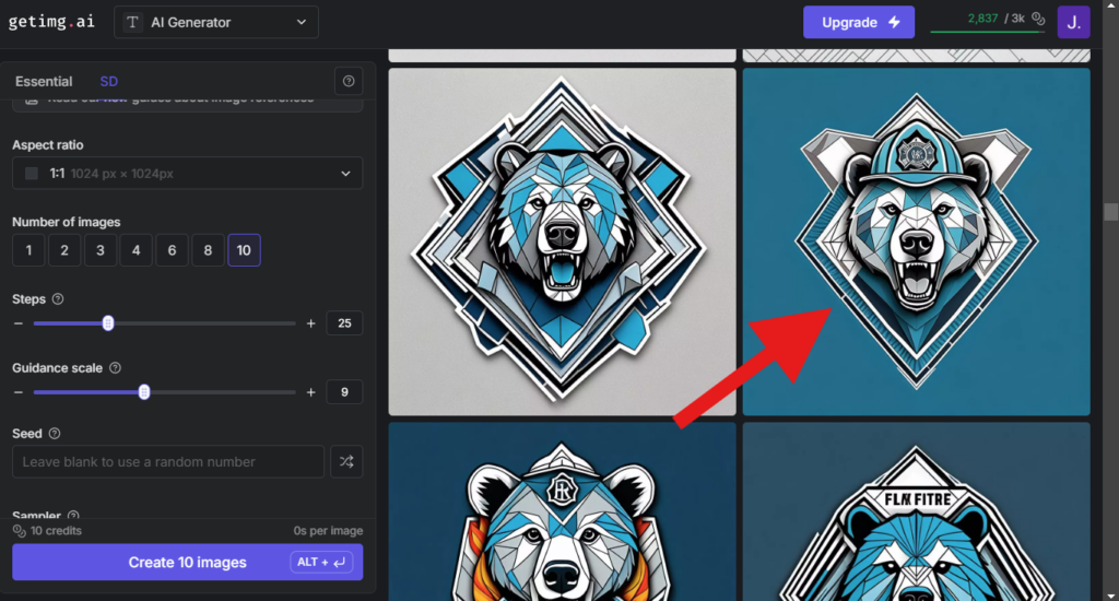
Generate and iterate — change the prompt and settings as needed — until you're happy with the result. For me, this typically takes about 100 images. Yes, really.
3. Once you find an image you're happy with, download it.
Pro tip: upscale images before using them. It refines the details and makes manipulations (like tracing) smoother. If you already have an image that isn't high enough quality, upscaling can rescue it — plenty of services do this, including getimg.ai.
How to upscale in getimg.ai
Hover the mouse over the image
Click the "three dots" on the top right that come up
Click "Upscale 4x" in the menu
After upscaling, download the upscaled image (format doesn't matter)
Step outcome: an image in your downloads folder that you want on your project.
Installing a typeface (if desired)
A typeface is how the lettering looks (such as "Times New Roman" or "Comic Sans"). If the fonts already on your computer are fine, skip this step.
This project uses the free Naluka typeface. If you don't want to install it, everything still works — you'll just get a default system typeface instead.
1. Find a typeface. This project is a personal gift (I'm not selling it), so pretty much any typeface I find will work.
If you're working on something you will sell…
Then you'll need a typeface that's free for commercial use, a standard system typeface, or one you've purchased a commercial license for. The specifics are outside the scope of this project.
I went to 1001 Fonts (not sponsored, not affiliated). I wanted something tiki-ish to match the turtle, searched "Hawaii fonts", and used the first result: Naluka.
How to find and download a font from 1001 Fonts
Go to the home page and search for the style you want — I searched "Hawaii Fonts" and looked at what came up:
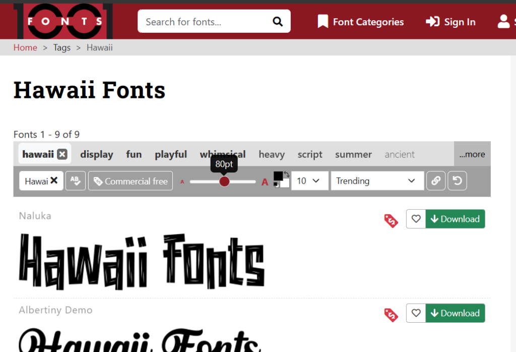
Click a font to open its details, then download it. Direct link to the one I used: https://www.1001fonts.com/naluka-font.html
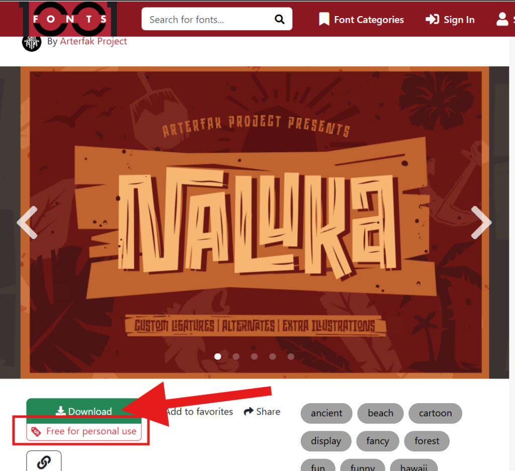
2. Install it.
How to install a downloaded typeface
1. Open your downloads folder
2. Open the ZIP file you just downloaded
3. Open one of the font files inside (I typically pick the largest one by file size, but any should work)
4. Click Install
Done — close everything out. Note: any programs you want to use the font in (Word, xTool Creative Space, whatever) need a restart before the new font shows up.
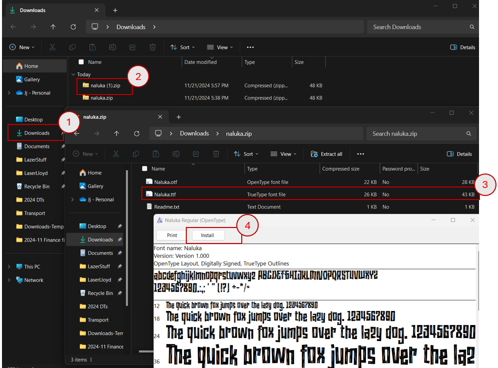
Step outcome: the fonts you want are installed on your computer.
Setting up xTool Creative Space
1. Open the program and create a new project.
Pro tip: save early and often. I've lost a lot of progress by not saving. I save multiple times while a project develops. This one got saved as "Fire Bear".
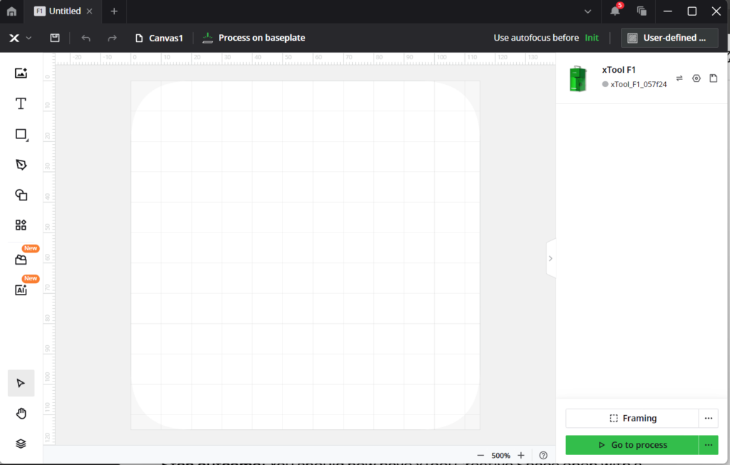
Step outcome: xTool Creative Space open with a new, saved project.
Prepping the image
1. Import the image (basically, drag it in).
How to import your image into xTool Creative Space
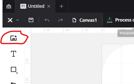
- In the new project, click the icon to add an image
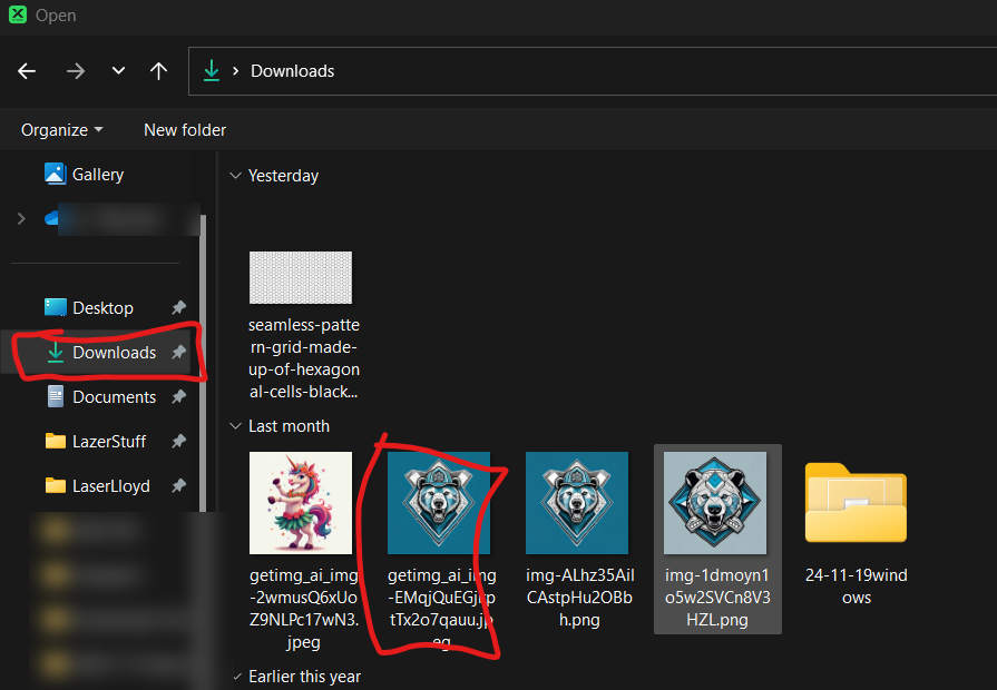
- A window pops up asking which image to import
- Select the image you generated and downloaded
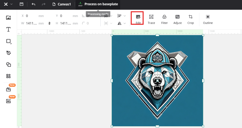
- Your image is now in xTool Creative Space
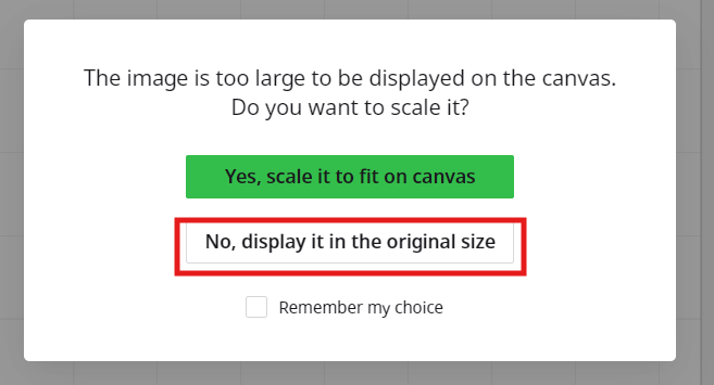
Import at original size or scaled?
A window might ask if you want to import the image at its original size or scaled down. Choose full size unless your computer starts chugging — then take the scaled version.
2. Edit to remove the background.
How to remove an image background in xTool
- With the image selected, choose the Edit function
- Select the Magic Wand tool, then click the background to remove it
- Adjust the Fuzziness setting if it's not grabbing the whole background
- CTRL+Z undoes any mistakes
- Click Save when it's clean
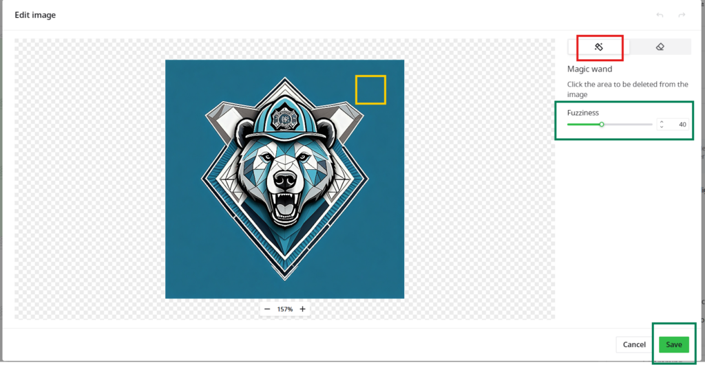
3. Adjust to convert to grayscale.
How to make the image grayscale
- With the background removed, select the image and click Adjust
- A dialog box comes up with options
- Use them to make the image grayscale
(lasers engrave shades of grey; high-end machines can do color on some metals, but that's outside this tutorial)
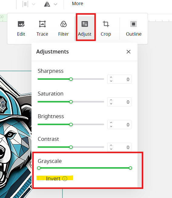
- Drag the lower and upper ends of the grayscale slider until the image looks the way you expect
- The other sliders in this menu adjust the whole image to your preference
Note: lasers usually darken material (they're burning it). If your material lightens under the laser instead — coated metal, like aluminum business cards — use Invert to get the correct color scheme.
- The other sliders in this menu adjust the whole image to your preference
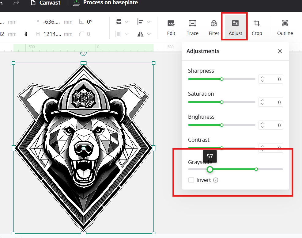
Step outcome: your image in grayscale with no background.
Arranging and adding text
1. Place the image where you want it.
- Shrink or enlarge it to fit your workspace — click and drag the corner handles to scale
- To move it, click the image, hover until the four-sided arrow shows up, then click and drag
2. Add text. Click the "T" icon and click in the workspace to place a text box.
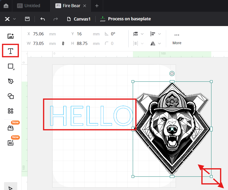
3. Type your text and change the typeface.
- Type what you want on the piece. I used two separate text boxes — a big main line and a smaller tagline underneath — so I could size and place them independently
- With the text selected, pick your typeface from the font dropdown in the top toolbar. Your newly installed font is in the list — if it isn't, restart xTool Creative Space (fonts only load at startup)
- Scale and position the text like any other object: corner handles to resize, drag to move
4. Do a final layout check. Everything ends up on a real object, not an infinite canvas — keep the whole design inside the area of the blank you're engraving, and leave breathing room at the edges. My tray is dished, so I kept the design in the flattest part of the bowl.
Step outcome: logo and text arranged exactly how you want them burned.
Engraving it
1. Set everything to Engrave. Select all your objects and set the processing type to Engrave in the panel on the right.
2. Pick your settings. Honesty time: I didn't write down my final power and speed numbers before this site went quiet, so I won't pretend to remember them. What I can tell you: start from Creative Space's built-in preset for dark hardwood (walnut territory), run a small test on the underside of your blank, and adjust from there. Dark wood needs a touch more contrast than light wood — err toward a deeper burn or the design washes out.
3. Position and focus. Put the blank under the laser, run framing to preview exactly where the design will land, and nudge until it's right. Then focus the machine on the surface — on the F1 that's the focus adjustment on the head. Focus on the surface you're actually engraving, not the tabletop; a dished tray sits lower in the middle than at the rim.
4. Run the job and watch it. Wood plus laser means smoke and the occasional flare. Stay with it. When it's done, wipe the soot off with a dry cloth and you're finished.
Where it can go wrong
- Curved surfaces fight the focus. A dished tray isn't flat, and the laser has a narrow band where it's truly sharp. Keep the design in the flattest zone or accept slightly soft edges. Mine held up fine, but a deeper bowl wouldn't have.
- Your new font doesn't show up. It's installed, but Creative Space was already open. Restart the program. This one gets everybody.
- Dark wood eats contrast. The preview on a white canvas lies to you — a mid-grey that looks fine on screen can vanish on dark hardwood. Push the grayscale adjustment harder than feels right.
- AI images need cleanup. Straight out of the generator there's usually background junk and mushy detail. Upscale first, remove the background properly, and check the grayscale conversion before you burn — the laser faithfully reproduces every flaw you leave in.
More laser builds are in the lasers section.
Related: Material Settings and Calibration — the settings notebook behind every burn on this site — plus Nametag Placard + Business Card Holder, Man Card: 5 AI Designs Engraved on Aluminum (xTool F1), and Black Aluminum Business Cards.