ThemeForge: a Drop-in CSS Theme System an AI Agent Installs in One Step
- Category
- AI & Local LLM
- Posted
- October 5, 2026
- Updated
- October 6, 2026
- By
- Jacob Lloyd — written with AI assistance, post-project
- Read time
- 29 min read
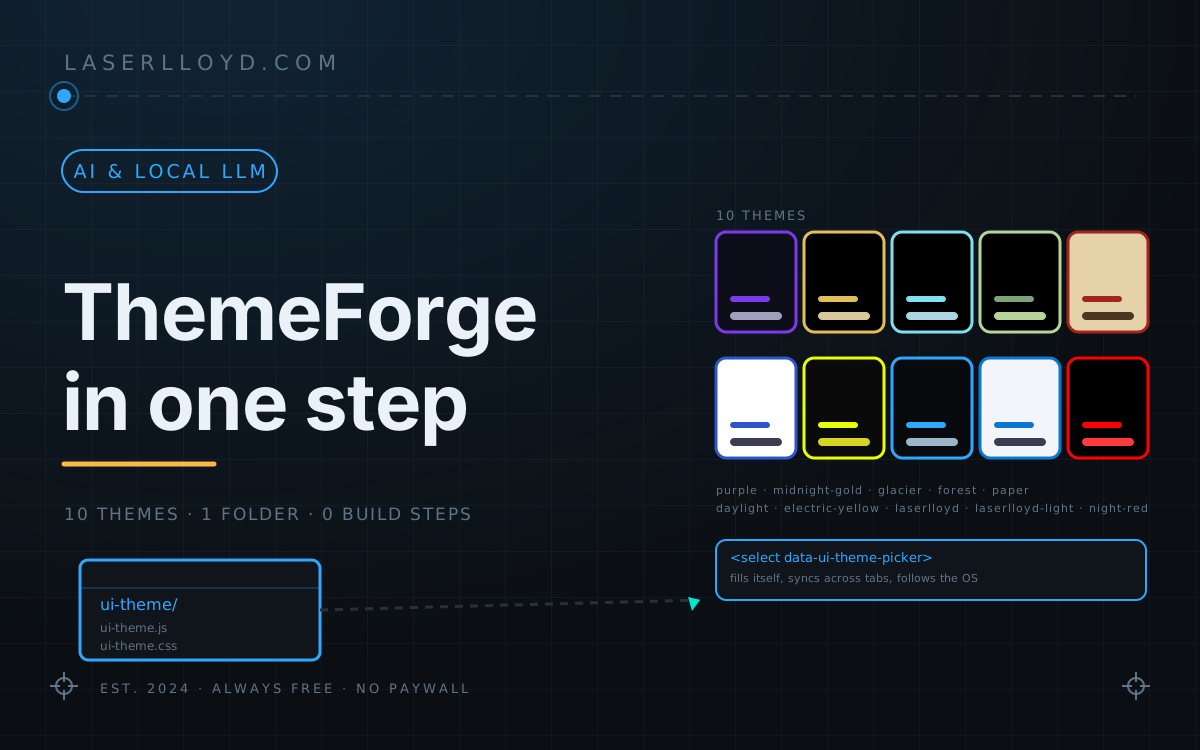
In plain terms: ThemeForge is a free folder of CSS and one small script that gives any web app a theme picker, ten colour themes and a full set of ready-made buttons, fields, cards and dialogs. It is built so an AI coding agent can drop it into an app with a single line: the agent follows a short file in the repo, and the app gets a working picker, a system-following default, and design tokens to build from.
Most web apps end up with three themes written in three different places: a :root block in the main CSS, a second block under @media (prefers-color-scheme: dark), and a third somewhere a developer pasted in to make the picker work. The result is the same every time: a control that looks one way on the home page, another way in the settings page, and a question on the issue tracker asking why the dark theme turns the footer blue. I wrote ThemeForge to make that class of problem impossible. It is one folder, ui-theme/, that holds the runtime, a base layer, the component classes, the tokens of all ten themes, a picker, optional Tailwind and Quasar adapters, and a short AGENTS.md written for an AI coding agent. Drop the folder in, add four lines to the page head, and the app has a working picker and a system-following default. The agent that installs it does the work from a single one-line command; the rest of this article is for whoever wants to look under the hood.
This article is the tour: what’s actually in the folder, the ten themes and what they are for, the contrast story, and the design tokens and component classes the rest of the article hands you as a reference card. The second half is deliberately a scannable reference — every token, every component, every public method — so a coding agent (or a future you) can lift it verbatim.
tl;dr
- Get it: github.com/LaserLloyd/ThemeForge — MIT, free; there's also a source zip in the Downloads box below.
- What it is: a single folder,
ui-theme/, that drops into any web app and gives it ten colour themes, a picker, about 250 design tokens, a base element layer, a text standard, and a full set of component classes (buttons, fields, switches, cards, dialogs, toasts, tables, an app shell). Plain CSS and one small script. No build step, no Node, no dependencies. - The one-line install (verbatim from the README):
python3 -c "import urllib.request as u,sys;sys.argv=['update.py','--dest','static/ui-theme'];exec(u.urlopen('https://raw.githubusercontent.com/LaserLloyd/ThemeForge/main/ui-theme/update.py').read())" - Head block (the order matters):
ui-theme.jsfirst (classic, blocking, neverdeferormodule), thenui-theme-base.cssandui-components.css, then the app's own CSS, thenui-theme.csslast so theme tokens win. - Picker: one element:
<select class="ui-select" data-ui-theme-picker aria-label="Theme"></select>. It fills itself and stays in sync across tabs. - Ten themes: six core (Purple, Midnight Gold, Glacier, Forest, Paper, Daylight) plus four opt-in (Electric Yellow, LaserLloyd, LaserLloyd Light, Night Red). Every theme passes a contrast audit with zero failures.
- Contrast: body text 7:1, secondary 6:1, every text tier on every surface 4.5:1, control edges and on/off states 3:1, on/selected/current read by shape and fill, not just colour.
- Built for AI agents: AGENTS.md is the install script in prose — point any agent at it and it works the picker in one step. The repo's own CI (GitHub Actions, three jobs) green on a clone, a contrast audit,
node --checkon every JS file, and a headless Chrome run of the runtime tests.
Where to get it
One MIT-licensed repo: github.com/LaserLloyd/ThemeForge, with AGENTS.md as the install script and the contrast report as the audit. Prefer a zip? The Downloads box at the end of this page has the full source, and the site’s Downloads page lists it too. If you are not on a machine with Python, the README also lists git clone –depth 1, npx degit, and a jsDelivr <script> URL pinned to @v1.0.0 for prototypes.
What you end up with
A question away from the user’s preferred look: a header with a picker that already knows every theme, a dark and a light default that follow the OS, and a single line of CSS in the app’s codebase that says background: var(–surface-2) instead of #1d1d39. Pick a theme, reload, and there is no flash — the runtime script runs synchronously in <head>, reads its own data-* settings from the tag, and sets the theme before the first paint. Open the picker in two tabs, change the theme in one, and the other repaints to match (a storage event listener). Print a dark or OLED theme and the runtime swaps to a light partner for the duration of the print job (or hides navigation, depending on the data-print-theme knob) so the printed page is legible on paper; print a light theme and the page prints as-is.
ui-app, ui-card, ui-btn, ui-switch and the --surface-* / --text-* / --accent tokens. The picker is one <select data-ui-theme-picker> — the runtime fills and syncs it.The figure above is the in-page demo, not a screenshot of a separate file. The real specimen — every component in every theme — is at specimen/index.html in the repo (open via python3 -m http.server then /specimen/).
How it fits together
The runtime is one small script, ui-theme.js (about 23 KB, 575 lines), that does three things in order. It reads its own data-* attributes from the <script> tag it lives in (so the settings travel with the file), looks at localStorage and the OS light/dark preference, and writes the chosen theme to <html data-palette> and the active ground to <html data-theme> (one of amoled, dark, light) before the first paint. Then it walks the document for <select data-ui-theme-picker> elements and fills them with the enabled theme list (and listens for any that a framework renders later). Then it exposes window.UITheme and, when ui-components.js is loaded, window.UIComponents, and wires a storage event listener so two tabs stay in sync. The CSS is plain: ui-theme-base.css sets the page text, links, focus ring, scrollbars and reduced-motion defaults; ui-components.css draws the buttons, fields, switches, cards, dialogs, toasts and tables; ui-theme.css is the only file that changes between themes — it defines every token (colour, type, space, radius, shadow, motion) for all ten themes under a [data-palette=”…”] selector (Purple is :root, so it is the absence of data-palette). The runtime picks the theme; the CSS paints it.
The OS theme follow is the part that surprises people: data-default=”auto” reads prefers-color-scheme on every page load, and the runtime combines it with the visitor’s stored pick (or with data-default-dark and data-default-light) to pick a theme. Change the OS theme and refresh — the page follows. Pick a theme explicitly in the picker and that wins until the user clears it (or calls UITheme.reset()). The runtime also wires a storage event so two open tabs of the same app stay in sync without a server round trip.
Install
The repo’s AGENTS.md is the full walkthrough; the short version is the one line below and a four-tag head block. From the app’s root:
python3 -c "import urllib.request as u,sys;sys.argv=['update.py','--dest','static/ui-theme'];exec(u.urlopen('https://raw.githubusercontent.com/LaserLloyd/ThemeForge/main/ui-theme/update.py').read())"
It downloads the installer, which fetches the latest release, checks every file against its SHA-256 list in files.json and writes the folder. On Windows use python or py instead of python3; the line is the same in PowerShell, cmd and bash. The four lines in every page’s <head>:
<script src="/static/ui-theme/ui-theme.js"
        data-themes="purple,midnight-gold,glacier,forest,paper,daylight"
        data-default="auto" data-default-dark="midnight-gold" data-default-light="daylight"
        data-storage-key="myapp.theme"></script>
<link rel="stylesheet" href="/static/ui-theme/ui-theme-base.css">
<link rel="stylesheet" href="/static/ui-theme/ui-components.css">
<!-- your stylesheets -->
<link rel="stylesheet" href="/static/ui-theme/ui-theme.css">
Three rules, each for a reason. The ui-theme.js script is classic and blocking — never type=”module”, defer or async — because it reads its settings from its own tag (document.currentScript, which is null for module scripts) and sets the theme before the first paint. The base and component layers load before the app’s CSS so the app’s own rules win at equal specificity. ui-theme.css loads after, so an old app variable can never shadow a theme token. The picker is one line: <select class=”ui-select” data-ui-theme-picker aria-label=”Theme”></select>. From script, UITheme.set(‘glacier’), UITheme.current(), UITheme.onChange(fn). The whole install takes about five minutes, per AGENTS.md’s preamble.
The agent that added this in one step, on a real app, looked like this: the human asked an AI coding agent to give the app a dark mode and a theme picker. The agent read AGENTS.md, ran the one-liner into static/ui-theme/, pasted the four head-block tags into the base template, replaced two colour literals with var(–surface-2) and var(–text-secondary), and dropped the picker in the header. Six lines of diff in the app, zero new dependencies. The contrast audit already covers every pair the components render, the runtime already follows the OS, and a future commit that hard-codes a colour is the only thing the lint step has to catch.
The themes
The first six are the core set an app offers by default; the opt-in four appear only when an app lists them. Every theme passes a contrast audit (docs/contrast-report.md): body text at 7:1, secondary text at 6:1 on every surface, every other text tier 4.5:1, control edges and on/off states at 3:1, on/selected/current read by shape as well as colour in every theme. The full list:
| Theme | Set | Ground | Description |
|---|---|---|---|
| Purple | core | dark | Violet accent and soft lavender text on deep indigo. The base theme: its values are the :root defaults. |
| Midnight Gold | core | OLED | Warm gold on true black, for OLED screens. |
| Glacier | core | OLED | Ice-blue text and signature on true black, with a deep teal accent. |
| Forest | core | OLED | Pale sage and lichen with bark browns on true black. |
| Paper | core | light | Warm parchment, ink-brown text, a serif for prose and a red accent. |
| Daylight | core | light | Clean white with a blue accent. |
| Electric Yellow | opt-in | dark | Acid yellow on graphite with tight radii and crisp strokes. |
| LaserLloyd | opt-in | dark | Laser blue on near-black graphite, from the author’s site. Pairs with LaserLloyd Light. |
| LaserLloyd Light | opt-in | light | The light partner of LaserLloyd. |
| Night Red | opt-in | OLED | Low-blue-light night theme: ember text on true black, red structure, zero blue in any colour. |
Three of the four opt-ins are loud on purpose. Electric Yellow is the one I use when I am reviewing CSS in the dark and want the page to be louder than my editor; LaserLloyd matches this site’s blue-and-graphite look for consistency between the site and an app I am building on it; Night Red is a separate “night profile” that the contrast tool checks against a relaxed 171-row set (the standard 147 plus extra rows for low-light conditions) and where every token in the palette has zero in the blue channel (docs/contrast-report.md “Zero-blue audit” pass; README.md §Night Red; docs/THEMES.md §Night Red).
Gotchas
- A hard-coded colour in your CSS is the bug, not the theme. The audit only checks tokens; a
color: #fffin app code stays white in every theme.tools/lint_colors.py(in the repo) and the grep in AGENTS.md §8 catch this; the lint in CI does not run that step, so run it locally before merging. ui-theme.jsmust be first in<head>, classic, notdeferormodule. A module script has nodocument.currentScript, and the runtime reads its owndata-*from the tag. The symptom is a flash of the wrong theme, then the right theme.ui-theme.cssmust load after the app’s CSS, not before. The order is: base, components, app, tokens. An app rule of the same specificity that loads after the tokens loses.data-themescontrols what the picker shows. A stored theme whose slug is not indata-themesis ignored on the next load (the runtime falls back to the default). When you remove a theme, add adata-legacy-key+data-legacy-maponce, and the stored value is migrated.- Tailwind’s
rounded-mdandfont-sanschange after install. That is expected: the theme defines–radius-and–font-tokens, and its values win. Don’t fight it. - Next.js hydration warning. Add
suppressHydrationWarningto<html>and silence theno-sync-scriptslint rule for the head block: the runtime sets attributes on<html>before React hydrates. - Another library reads
data-themeon<html>(daisyUI, Pico). The runtime writesdata-theme=”amoled|dark|light”there; check the library does not react to that. If it does, put a different attribute on it viadata-mirror-attr. - Don’t edit anything inside
ui-theme/. The folder is replaced on update; the lint catches hand-edits and the install will refuse to overwrite an edited file. Move the change into the app’s own CSS instead. - The fonts named in the stacks are not bundled. Every stack falls back to system fonts; if you want Inter, JetBrains Mono, Space Grotesk or Archivo, load them yourself (the integrations doc has a copy-paste
<link>). prefers-contrast: moreraises lines and the quietest text tier. No theme flag needed; the runtime listens and the CSS responds. Thehigh-contrasttoken group is the legacy opt-in for the same effect.
Where this leaves me
What I wanted was a way to give every app I build a real theme system without writing one from scratch each time, and ThemeForge is the version of that I am willing to keep. The folders I drop into apps are now ui-theme/ and whatever the app does; the four head-block tags and the picker are the same in every framework. The agent that installs it reads AGENTS.md, not a Slack message. The contrast audit, the headless Chrome runtime tests, and node –check on every shipped JS file are what give me the nerve to keep moving. It’s at 1.0.0 because tokens are the public API and a token rename is a major version; a release is a git tag, the folder VERSION matches, and the JSON files are signed by the same checksum list that update.py checks against. The repo’s own CI is green on Linux, Windows and Python 3.9, and the same checks pass on a fresh clone on this machine.
Reference (for AI agents)
The rest of this article is the reference card a coding agent (or a future me) can lift verbatim. The first half above is the prose; the second half is structured, scannable and built for a tool to read. Every token, every component class, every public method on window.UITheme and window.UIComponents, every theme, every script-tag knob, every adapter, the full install path, the contrast contract, and the version block are below.
File manifest
The repo has two trees that matter: the drop-in bundle the app copies, and the design and tooling that build it. The article is about the bundle.
Drop-in bundle — what the app copies (ui-theme/):
| File | Size | Lines | What it is |
|---|---|---|---|
ui-theme.js |
23,515 B | 575 | Runtime: applies the saved theme before first paint, follows OS light/dark with data-default="auto", fills pickers, syncs tabs, exposes window.UITheme |
ui-theme-base.css |
13,255 B | — | Element defaults: body text, links, headings, code, focus ring, scrollbars, reduced motion, text tiers, .ui-markdown, highlight.js colours |
ui-components.css |
51,344 B | — | Components: buttons, fields, checkboxes, radios, switches, cards, badges, callouts, tabs, segmented controls, tables, dialogs, menus, tooltips, toasts, progress, code blocks, an app shell |
ui-theme.css |
86,389 B (21,197 B gzipped) | — | All ten themes’ tokens (about 20 KB gzipped) |
ui-components.js |
5,441 B | 135 | Optional themed confirm(), alert(), prompt() and toast() |
ui-theme.d.ts |
2,841 B | — | TypeScript declarations for window.UITheme and window.UIComponents |
update.py |
16,081 B | — | Installs and updates the folder; checks every file against its SHA-256 |
themes.json |
4,089 B | — | Theme list (name, family, ground, set, swatch, fonts) |
files.json |
1,401 B | — | The checksum list update.py verifies against |
VERSION |
30 B | — | Folder version (ThemeForge 1.0.0 3db64d9f574f) |
README.md |
6,342 B | — | Bundle-local usage notes |
adapters/quasar.css |
24,997 B | — | NiceGUI/Quasar mapping |
adapters/quasar.js |
1,468 B | 40 | NiceGUI/Quasar JS bridge |
adapters/tailwind.css |
4,399 B | — | Tailwind CSS v4 @theme inline mapping |
adapters/tailwind-v3.preset.js |
2,915 B | 54 | Tailwind CSS v3 preset |
The design and tooling that build the bundle (not copied into the app):
| File | Size | What it is |
|---|---|---|
README.md |
6,592 B | Repo README |
AGENTS.md |
19,063 B | The install script in prose, for AI agents |
CHANGELOG.md |
4,425 B | Version history (1.0.0 is the first release) |
CLAUDE.md |
1,498 B | Repo conventions for Claude |
CONTRIBUTING.md |
4,476 B | Working on the themes |
LICENSE |
1,067 B | MIT, copyright (c) 2026 (the upstream file names the author by personal name; the brand form is what the site quotes, and the on-disk string is in the upstream LICENSE); not included in the download zip (the upstream copyright line names the author by personal name, and the site’s content-guard treats that as an unreviewable identity disclosure) |
docs/TOKENS.md |
15,391 B | Every token, by group |
docs/COMPONENTS.md |
13,889 B | Every component class, with markup |
docs/THEMES.md |
8,081 B | The themes, design notes, adding a theme |
docs/INTEGRATIONS.md |
10,604 B | Per-framework install steps |
docs/TEXT.md |
5,465 B | Text tiers and the markdown style |
docs/UPDATING.md |
4,134 B | Updates, pinning, caching, what the checksums prove |
docs/contrast-report.md |
124,372 B | The contrast audit (10 themes × 147–171 rows) |
docs/theme-template.css |
9,854 B | A blank theme skeleton for tools/sync_theme.py |
tokens/<theme>.json |
~57 KB each | Every theme’s resolved tokens in W3C DTCG JSON |
examples/static-html/ |
3,731 B index | A plain HTML/CSS/JS example |
examples/fastapi-jinja/ |
2,172 B app.py | A FastAPI + Jinja example |
specimen/index.html |
17,721 B | Every component in every theme, served locally |
tools/check_contrast.py |
43,171 B | The contrast audit (run in CI) |
tools/lint_colors.py |
22,711 B | Lints colour literals out of the app’s CSS |
tools/sync_theme.py |
41,671 B | Rebuilds ui-theme.css, tokens/*.json, docs/contrast-report.md from src/css/*.css |
tools/update.py |
16,081 B | The install/verify script (mirrors ui-theme/update.py) |
tools/screenshots.py |
3,273 B | Theme previews for docs/images/ |
tests/test_tools.py |
17,606 B | Python unit tests (32 in this clone, 1 skipped) |
tests/run_browser_tests.py |
3,570 B | Headless Chrome tests of the runtime |
tests/runtime.html |
24,930 B | The browser-test harness |
.github/workflows/ci.yml |
— | CI: contrast, node --check, unit tests, browser tests, CRLF check, on Linux, Windows and Python 3.9 |
The repo’s own CI runs in three jobs (checks on Ubuntu with Python 3.12, tools-on-windows on Windows with Python 3.11, updater-on-oldest-python on Ubuntu with Python 3.9). The local clone passes node --check on every shipped JS file, the contrast tool reproduces all ten rows of the audit, and the unit tests pass (32 passed, 1 skipped in 1.212 s on Linux, Python 3.14, 2026-10-05).
Design tokens (groups, role, example value)
Every theme resolves every token. The values below are Purple’s (the :root base); the rest of the themes have their own resolved values in tokens/<theme>.json (DTCG JSON). Use a token with var(--name). Never redeclare a token in app CSS — give app variables an app prefix (--myapp-sidebar-w) or alias a token (--myapp-brand: var(--accent)). Source: docs/TOKENS.md.
| Group | Token | Role | Example (Purple) |
|---|---|---|---|
| Surfaces | --surface-void |
darker than page (full-bleed) | #08080f |
| Surfaces | --surface-0 |
the page | #0e0e1b |
| Surfaces | --surface-1 |
nav | #14142a |
| Surfaces | --surface-2 |
cards | #1d1d39 |
| Surfaces | --surface-3 |
hover | #232342 |
| Surfaces | --surface-4 |
active | #262648 |
| Surfaces | --surface-sunken |
inset wells | #0a0a14 |
| Surfaces | --surface-overlay |
menus, popovers | #1d1d39 |
| Surfaces | --glass-1/2/3 |
translucent panes | rgba(29,29,57,.72/.84/.92) |
| Surfaces | --glass-highlight |
glass sheen | rgba(255,255,255,.055) |
| Surfaces | --code-bg |
code background | #0b0b16 |
| Text | --text-primary |
main text | #e8e8f0 |
| Text | --text-secondary |
labels, descriptions | #a0a0bd |
| Text | --text-tertiary |
hints, timestamps | #8d8db0 |
| Text | --text-disabled |
disabled controls | #717195 |
| Text | --text-inverse |
text on a light fill | #0e0e1b |
| Text | --text-link / --text-link-hover |
links and accent text | #a78bfa / #c4b5fd |
| Text | --on-accent / --on-danger / --on-success / --on-warning / --on-media / --on-media-muted |
label on a fill | #ffffff / #2a0808 / … |
| Accent | --accent / --accent-hover / --accent-pressed |
brand accent, primary actions | #7c3aed / #8250f0 / #6d28d9 |
| Accent | --accent-subtle / --accent-muted / --accent-glow |
tinted bg, soft fill, glow | rgba(124,58,237,.16/.26/.35) |
| Accent | --accent-rgb |
so JS can compose rgba(var(--accent-rgb), .2) |
124,58,237 |
| Accent | --accent-2 / --accent-2-subtle |
secondary accent | #5eead4 |
| CTA | --cta / --cta-hover / --cta-pressed / --on-cta |
strong action plate | #7c3aed / #8250f0 / #6d28d9 / #ffffff |
| CTA | --cta-shadow / --cta-shadow-hover |
drop shadows for the plate | 0 6px 20px rgba(124,58,237,.28) / .38 |
| CTA | --highlight / --highlight-subtle / --on-highlight |
marks, tip colour | #fcd34d / rgba(252,211,77,.12) / #251a00 |
| Lines | --border-subtle / --border / --border-strong |
form-control edges are --border-strong at 3:1 |
#21213b / #292945 / #6f6f9c |
| Lines | --divider |
thin lines | #21213b |
| Lines | --focus-ring / --focus-ring-width / --focus-ring-offset |
the focus ring | #a78bfa / 2px / 2px |
| Lines | --glass-stroke / --glass-stroke-strong |
glass borders | rgba(255,255,255,.08/.16) |
| Control states | --selected / --on-selected |
on / checked / pressed / current | per theme |
| Control states | --unselected-border / --unselected-fg |
off outline, 3:1 on every surface | per theme |
| Status | --success / --warning / --danger / --info |
dots, bars, fills | per theme |
| Status | --success-text / --warning-text / --danger-text / --info-text |
text colour of each status | per theme |
| Status | --success-subtle / --warning-subtle / --danger-subtle / --info-subtle |
tinted background of each status | per theme |
| Status | --success-border / --warning-border / --danger-border / --info-border |
status borders | per theme |
| Status | --idle / --idle-text / --idle-subtle / --idle-border / --idle-hover |
neutral state | per theme |
| Status | --live / --live-text / --live-subtle / --live-border / --live-hover |
“live” / “running” indicator | per theme |
| Code / syntax | --syn-bg / --syn-fg / --syn-comment / --syn-keyword / --syn-string / --syn-number / --syn-function / --syn-attr / --syn-tag / --syn-builtin / --syn-type / --syn-variable / --syn-literal / --syn-operator / --syn-title / --syn-addition |
syntax highlight ramp | per theme |
| Code / syntax | --code-header-bg / --code-stroke |
code block chrome (dark in every theme) | per theme |
| Charts | --cat-1 … --cat-12 |
series colours, 3:1 on --surface-0 |
per theme |
| Charts | --seq-1 … --seq-5 |
low-to-high ramp | per theme |
| Charts | --div-1 … --div-5 |
bad, neutral, good | per theme |
| Charts | --chart-grid / --chart-axis |
chart chrome | per theme |
| Bubbles | --bubble-user-text / --bubble-assistant-text / --bubble-user-bg / --bubble-assistant-bg |
chat bubbles | per theme |
| Bubbles | --rp-speech / --rp-thought / --rp-shout / --rp-whisper / --rp-ooc / --rp-action / --rp-critical |
roleplay bubble colours | per theme |
| Diff | --diff-add-bg / --diff-add-text / --diff-remove-bg / --diff-remove-text |
diff view | per theme |
| Typo | --fs-xs / --fs-sm / --fs-md / --fs-lg / --fs-xl / --fs-2xl |
font sizes | per theme |
| Typo | --fw-medium / --fw-semibold / --fw-bold |
weights | per theme |
| Typo | --font-sans / --font-mono / --font-display |
stacks | per theme |
| Spacing | --space-1 … --space-8 |
4–64 px | per theme |
| Radii | --radius-sm / --radius-md / --radius-lg / --radius-pill |
control shapes | per theme |
| Shadows | --shadow-1 / --shadow-2 / --shadow-3 / --shadow-4 |
drop shadow levels | per theme |
| Z-layers | --z-modal / --z-toast / --z-popover / --z-nav |
stacking | per theme |
| Motion | --motion-fast / --motion-med / --motion-slow / --easing-standard |
timings (reduced-motion stops loops) | per theme |
| Markdown | --md-bold / --md-italic / --md-bolditalic / --md-bolditalic-glow |
in-app markdown | per theme |
| Misc | --mark-bg / --selection-text / --selection-bg / --media-filter / --quote-bar / --heartbeat-text / --heartbeat-hover / --offline-text / --on-offline / --canvas-handle |
small features | per theme |
Source: docs/TOKENS.md (22 groups, ~270 tokens — grep -oE '\| \(–[a-zA-Z][a-zA-Z0-9-]*)` |’ docs/TOKENS.md | sort -u | wc -lreturns 272 unique token names; 22## ` groups).
Component classes (every modifier, one line)
State is from native attributes (disabled, checked, aria-pressed, aria-selected, aria-current, aria-invalid, aria-busy, [open]) — never an extra class. Most selectors are one class so an app rule of equal specificity that loads later wins. Logical properties throughout (works right-to-left). On, checked, pressed and current are filled with --selected; off is an outline; disabled is dashed and unfilled. Source: docs/COMPONENTS.md.
| Class | Modifiers / parts | What it is |
|---|---|---|
ui-stack |
— | Column, gap --space-3 |
ui-row |
— | Wrapping row, centred, gap --space-2 |
ui-grid |
--ui-grid-min |
Auto-fill columns, min set on the element |
ui-container |
— | Centred, max-width --content-max |
ui-spacer |
— | Pushes the rest of a row to the end |
ui-app |
__header __nav __main |
App shell (header, side nav, main); nav hides below 760 px |
ui-brand |
— | App title in the header |
ui-nav |
__label __item |
Side navigation |
ui-title / ui-heading / ui-subheading / ui-lead / ui-kicker / ui-small / ui-mono / ui-num / ui-kbd / ui-code / ui-divider |
— | Type ramp (<hr> is .ui-divider) |
ui-text-primary / -secondary / -tertiary / -disabled / -link |
— | Text-tier classes (use the tokens for new code) |
ui-markdown |
— | A container of rendered markdown; see docs/TEXT.md |
ui-btn |
--primary --ghost --outline --danger --cta --sm --lg --icon --block |
Buttons; works on <a> too; pairs with aria-pressed / aria-busy / disabled |
ui-btn-group |
— | Adjacent buttons share a rounded edge |
ui-field |
— | Form-field container (label + control + help) |
ui-label |
— | Field label |
ui-input |
--sm |
Text input |
ui-select |
— | Styled <select>; data-ui-theme-picker mounts the theme picker |
ui-textarea |
— | Styled <textarea> |
ui-help |
— | Field help text (links to aria-describedby) |
ui-error |
— | Field error text (links to aria-describedby); shown when aria-invalid="true" |
ui-input-group |
— | Input + button pair (e.g. search) |
ui-check |
— | Checkbox / radio / switch row |
ui-checkbox |
— | Native <input type="checkbox"> styled |
ui-radio |
— | Native <input type="radio"> styled |
ui-switch |
— | role="switch" checkbox styled as a switch |
ui-switch-state |
data-on data-off |
“On” / “Off” label (aria-hidden; the switch announces its own state) |
ui-range |
— | Native range input coloured with --slider-color |
ui-segmented |
— | Group of buttons that act as a radio |
ui-tabs |
ui-tab |
Tab list (link tabs use <a aria-current="page">); keyboard handling is the app’s job |
ui-card |
__header __title __footer --raised --interactive |
Card; aria-selected / aria-current outline a selected card |
ui-well |
— | Inset well (logs, previews, secondary content) |
ui-stat |
__label __value |
A label / value pair |
ui-badge |
--success --warning --danger --info --live --accent --neutral |
Pill badge |
ui-dot |
--success --warning --danger --info --live --neutral |
Status dot |
ui-count |
--accent --danger |
Counter chip |
ui-callout |
--info --success --warning --danger __title |
A coloured callout (use role="alert" for errors) |
ui-table-wrap |
— | Wraps <table class="ui-table"> for sticky headers / scroll |
ui-table |
--hover --compact td.num |
Table styles |
ui-dialog |
— | <dialog> styled |
ui-drawer |
— | Side sheet on <dialog> |
ui-menu |
__item |
Menu list |
[data-ui-tooltip] |
data-ui-tooltip-side="bottom" |
Tooltip on any element |
ui-progress |
— | Linear progress bar |
ui-spinner |
— | Spinner |
ui-skeleton |
— | Loading skeleton |
ui-breadcrumbs |
— | Breadcrumb list |
ui-pagination |
— | Pagination |
ui-avatar |
— | Avatar circle |
ui-chip |
__remove |
Removable / selectable chip |
ui-details |
— | Accordion on <details> |
ui-fieldset |
— | Fieldset + legend |
ui-codeblock |
__bar |
<figure> of <figcaption class="ui-codeblock__bar"> + <pre> |
ui-empty |
— | Empty state |
ui-bubble |
--user --assistant |
Chat bubble |
Public methods on window.UITheme and window.UIComponents
Source: ui-theme/ui-theme.d.ts (TypeScript declarations for both globals).
window.UITheme (UIThemeApi):
| Member | Type | What it does |
|---|---|---|
version |
string (read-only) |
The folder version, e.g. "1.0.0" |
config |
object (read-only) | { themes, default, auto, storageKey, families, printTheme } |
current() |
() => string |
The active theme slug |
theme([slug]) |
(slug?) => UIThemeInfo \| null |
Info about one theme (or the active one) |
list() |
() => UIThemeInfo[] |
All enabled themes |
set(slug) |
(slug) => string |
Switch to a theme; returns the slug |
reset() |
() => string |
Back to the default; returns the slug |
partner([slug]) |
(slug?) => string \| null |
The light/dark partner in a family (e.g. laserlloyd ↔ laserlloyd-light) |
toggleFamily() |
() => string \| null |
Toggle to the partner; returns the new slug |
onChange(listener) |
(fn) => () => void |
Subscribe; returns an unsubscribe; detail.print is true for the swap around printing |
token(name, [el]) |
(name, element?) => string |
Raw token value (e.g. "#7c3aed") |
tokens(names, [el]) |
(names, element?) => Record<name, string> |
Many at once |
color(name) |
(name) => string |
Resolved rgb() colour for canvas |
colors(names) |
(names) => Record<name, string> |
Many resolved colours for canvas |
mountPicker(target, [opts]) |
(elOrSel, options?) => HTMLSelectElement \| null |
Fill a select as the picker; options are { label, coreLabel, optInLabel, systemLabel } |
The ui-theme-change event fires on document with { slug, theme, previous, print }.
window.UIComponents (UIComponentsApi): (requires ui-components.js)
| Method | Signature | What it does |
|---|---|---|
confirm |
(opts: UIDialogOptions \| string) => Promise<boolean> |
Themed confirm(); options are { title, message, label, confirmLabel, cancelLabel, danger } |
alert |
(opts: UIDialogOptions \| string) => Promise<void> |
Themed alert() |
prompt |
(opts: UIPromptOptions \| string) => Promise<string \| null> |
Themed prompt(); resolves to null on cancel; extra options are { value, placeholder, type } |
toast |
(message, { kind?, timeout? }) => HTMLElement |
Toast with kind info / success / warning / danger; returns the element |
window.UI_THEME_MANIFEST (optional, takes precedence over the script-tag defaults): { themes, default, defaultDark, defaultLight, storageKey, families, legacy, mirrorAttr, fontsHref, printTheme }. themes accepts an array or a comma string.
Script-tag knobs (data-* on the <script> tag)
| Attribute | Default | What it does |
|---|---|---|
data-themes |
the six core themes (purple,midnight-gold,glacier,forest,paper,daylight) |
Comma-separated list of enabled themes; controls the picker and what stored values are honoured. With no data-themes set, ui-theme.js enables the six themes with set==="core" (ui-theme.js:147-149). |
data-default |
the first enabled theme (the first slug in data-themes, or purple if none are enabled and not auto) |
The default theme slug, or auto to follow the OS. The literal string auto enables OS-follow via prefers-color-scheme (ui-theme.js:164); a missing/empty attribute resolves to the first enabled theme (ui-theme.js:177-179). |
data-default-dark |
the first enabled non-light theme (first slug in data-themes whose ground !== "light", else the first enabled theme, else purple if nothing is enabled) |
The dark half of auto. ui-theme.js:168-175 picks this when the OS prefers dark and no explicit value is set. |
data-default-light |
the first enabled light theme (first slug in data-themes whose ground === "light", else the first enabled theme, else purple if nothing is enabled) |
The light half of auto. Same code path (ui-theme.js:168-175). |
data-storage-key |
ui-theme |
The localStorage key the visitor’s pick is stored under (ui-theme.js:185). AGENTS.md §3 recommends overriding with <appname>.theme so the app’s choice doesn’t collide with another ThemeForge app on the same origin. |
data-families |
false |
Group themes by family in the picker |
data-print-theme |
auto |
What the page prints as: when the active theme is dark or OLED, auto swaps to the family’s light partner (or the first enabled light theme, or daylight); a slug prints that theme; none does not swap; when the active theme is light, the page prints as-is (ui-theme.js:474-490). |
data-legacy-key |
— | An older storage key to migrate once (with data-legacy-map) |
data-legacy-map |
— | A from→to map for legacy values (JSON object) |
data-mirror-attr |
— | Mirror the active theme onto a different attribute (for libraries that read it) |
data-fonts-href |
— | A stylesheet to inject for the theme’s font stack |
Source: ui-theme.js:147-149, 164, 168-174, 185, 474-490 (runtime defaults) and AGENTS.md §3, §12 (recommended overrides — e.g. set data-themes to the six core, data-default="auto", data-storage-key="<appname>.theme").
Adapters
| Adapter | Files | What it does |
|---|---|---|
| NiceGUI / Quasar | adapters/quasar.js + adapters/quasar.css |
Load adapters/quasar.js right after ui-theme.js and adapters/quasar.css right after ui-theme.css (via ui.add_head_html). Quasar’s toggles, checkboxes and radios use the control-state design; disabled controls are dashed at full opacity. Remove any ui.dark_mode() call — the adapter handles it. |
| Tailwind CSS v4 | adapters/tailwind.css |
@import "./<path>/ui-theme/adapters/tailwind.css"; after @import "tailwindcss";. Exposes bg-surface-2, text-fg, text-fg-muted, bg-accent, text-on-accent, border-line, etc. Text uses fg-* because text-* sizes belong to Tailwind. |
| Tailwind CSS v3 | adapters/tailwind-v3.preset.js |
presets: [require('./<path>/ui-theme/adapters/tailwind-v3.preset.js')]. Same tokens as the v4 adapter, expressed as a v3 preset. |
The Tailwind adapter maps the theme’s tokens; the Quasar adapter maps the component classes. Neither is required for the rest of the bundle to work.
The full install path (verbatim, the install portion of AGENTS.md)
AGENTS.md is the install script in prose, written for an AI coding agent. The first two sections are quoted below in full; this is the prompt an AI agent would be pointed at. Characters are escaped per the article-forge skill’s §8 rule (a raw <blockquote> runs markdown literally, so <, >, & are escaped to <, >, &).
## 1. Decide once | Question | Default answer | |---|---| | Where does the folder go? | The app's static folder, served as-is: `static/ui-theme/` (Flask, FastAPI, Django), `public/ui-theme/` (Vite, Next.js, Create React App), `app/static/ui-theme/`, or next to `index.html` for a plain site. | | Which themes? | The six core themes: `purple,midnight-gold,glacier,forest,paper,daylight`. Add an opt-in theme (`night-red`, `electric-yellow`, `laserlloyd`, `laserlloyd-light`) only if the user asked for it. | | Default theme? | `auto`: follow the visitor's OS light/dark setting until they pick (`data-default-dark="midnight-gold"`, `data-default-light="daylight"`). | | Storage key? | `<appname>.theme`, e.g. `notes.theme`. | ## 2. Install Run from the app's root folder (Python 3.9 or newer; change `static/ui-theme` to the folder you chose):On Windows use `python` (or `py`) instead of `python3`; the line is the same in PowerShell, cmd and bash. It downloads the installer, which fetches the latest release from GitHub, checks every file against its checksum list and writes the folder. Later updates are `python3 static/ui-theme/update.py`. Offline: download a release archive (`.tar.gz`) elsewhere, then run `python3 update.py --source <archive> --dest static/ui-theme` with the `update.py` from its `ui-theme/` folder. Other ways, if Python is not available: - **git:** `git clone --depth 1 https://github.com/LaserLloyd/ThemeForge.git ut-tmp`, copy `ut-tmp/ui-theme` into the app, delete `ut-tmp`. - **Node:** `npx degit LaserLloyd/ThemeForge/ui-theme#v1.0.0 static/ui-theme`. - **No install (prototypes, single HTML files):** load the files from jsDelivr, pinned to a release: `https://cdn.jsdelivr.net/gh/LaserLloyd/ThemeForge@v1.0.0/ui-theme/ui-theme.js` (and the same path for each CSS file). Never pin `@main`; the CDN caches it for up to 12 hours. A CDN page updates by changing the pinned version; `update.py` and steps 8.5, 9 and 10 below do not apply to it.python3 -c "import urllib.request as u,sys;sys.argv=['update.py','--dest','static/ui-theme'];exec(u.urlopen('https://raw.githubusercontent.com/LaserLloyd/ThemeForge/main/ui-theme/update.py').read())"
The rest of AGENTS.md (sections 3–12) covers the head block, picker, building from tokens, rules, charts, verification, the line to drop in the app’s own AGENTS.md so the next agent keeps the convention, the update command, the troubleshooting table, and the reference list above.
Contrast audit (summary, every theme)
tools/check_contrast.py runs in CI on every push. The full report is 124 KB (one section per theme, plus a summary) at docs/contrast-report.md; the summary is:
| Theme | Set | Profile | Checks | Failures |
|---|---|---|---|---|
| purple | core | standard | 147 | 0 |
| midnight-gold | core | standard | 147 | 0 |
| glacier | core | standard | 147 | 0 |
| forest | core | standard | 147 | 0 |
| paper | core | standard | 147 | 0 |
| daylight | core | standard | 147 | 0 |
| electric-yellow | opt-in | standard | 147 | 0 |
| laserlloyd | opt-in | standard | 147 | 0 |
| laserlloyd-light | opt-in | standard | 147 | 0 |
| night-red | opt-in | night | 171 | 0 |
The contract every theme meets: body text 7:1, secondary text 6:1 (the contrast report’s “the contract’s 6:1 promise” — docs/contrast-report.md flags every text-secondary on surface-2 row with that exact phrasing), every text tier on every surface 4.5:1, disabled 3:1, on-accent and on-status 4.5:1, status text on its tinted bg 4.5:1, on-selected 4.5:1, selected / unselected-border / unselected-fg on every surface 3:1, border-strong / control-track / focus-ring 3:1, syntax colours on --syn-bg 4.5:1 (comments 3.5:1), and the chart series (--cat-1 … --cat-12) 3:1 on --surface-0. On/off by shape: an “on” control is filled with --selected; an “off” control is an outline in --unselected-border; a switch’s “on” adds a bar to the knob, an “off” a ring. Disabled is dashed and unfilled in the disabled tier, even when on.
Frameworks
Per the docs/INTEGRATIONS.md outline: plain HTML · FastAPI, Flask, Starlette (Jinja templates) · Django · Vite, Vue, Svelte, SvelteKit, Astro · Next.js (app router) · NiceGUI (Quasar) · Tailwind CSS · Electron, Tauri, pywebview · Fonts · Charts · Content Security Policy. Per framework: put ui-theme/ where the framework serves static files, add the head block in the order AGENTS.md §3 specifies, and serve the folder no-cache (or version the URLs) so an update shows up. Two concrete examples ship in the repo: examples/static-html/ (a single page) and examples/fastapi-jinja/ (FastAPI + Jinja, 2,172-byte app.py).
Print, contrast and motion
Three things the runtime listens for and the CSS responds to, with no per-theme flag:
- Print —
data-print-themecontrols what prints (ui-theme.js:474-490): when the active theme is dark or OLED,autoswaps to the family’s light partner (or the first enabled light theme, ordaylight); a slug prints that theme;nonedoes not swap. When the active theme is light, the page prints as-is. Print hides the side nav, toasts, menus, drawers and tooltips. prefers-contrast: more— every theme steps up its lines to the control-edge strength and its tertiary text to the secondary tier.prefers-reduced-motion— stops loops and shortens animations;--motion-*tokens drop to 0.
Versions
From the repo at the tip this article describes (cloned 2026-10-05):
$ git log -1 --format='%h %ci'
56fb665 2026-10-05 21:46:52 +0900        # ThemeForge 1.0.0

$ cat ui-theme/VERSION
ThemeForge 1.0.0 3db64d9f574f

$ wc -c ui-theme/*.js ui-theme/*.css ui-theme/*.ts ui-theme/*.py 2>/dev/null
  23515 ui-theme.js
   5441 ui-components.js
   2841 ui-theme.d.ts
  16081 update.py
  13255 ui-theme-base.css
  51344 ui-components.css
  86389 ui-theme.css

$ node --check ui-theme.js ui-components.js
(node v24.18.0) — OK on both, and on adapters/quasar.js + adapters/tailwind-v3.preset.js

$ python -m unittest discover -s tests
Ran 32 tests in 1.212s
OK (skipped=1)

$ python tools/check_contrast.py --fail-on any
…
## Summary
| Theme | Set | Profile | Checks | Failures |
| purple | core | standard | 147 | 0 |
| midnight-gold | core | standard | 147 | 0 |
| glacier | core | standard | 147 | 0 |
| forest | core | standard | 147 | 0 |
| paper | core | standard | 147 | 0 |
| daylight | core | standard | 147 | 0 |
| electric-yellow | opt-in | standard | 147 | 0 |
| laserlloyd | opt-in | standard | 147 | 0 |
| laserlloyd-light | opt-in | standard | 147 | 0 |
| night-red | opt-in | night | 171 | 0 |
Targets: current Chrome, Edge, Firefox and Safari (2024 or newer). The layer uses :has(), color-mix() and the popover API; older browsers keep the colours, but some component states and menus degrade.
Related: ChatForge: a Local NPU AI Assistant for the Copilot Key · StudioForge: a GPU-only LLM server · DisPatch: self-hosted AI chat · My local AI agent stack · How to have an LLM adapt any project to your system
Downloads
Free for personal use. If it saves you an afternoon, the coffee button's nearby.